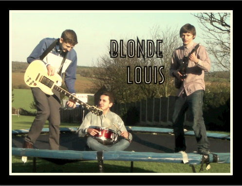
First attempt- Blonde Louis album cover.
This is my first idea for my Blonde Louis album. I think that it captures the band image well as it shows them as young fun people. Moreover the setting is in rural countryside which reflects the indie genre. However I think that it is missing something in terms of creativity. I don't believe that it looks like an album cover but more like the back of the album. One element that I like is the positioning of the text as it is clear and easy to read. Another is the props of the music instruments, it clearly identifies them as a band and their style of music.

2nd attempt- Blonde Louis album cover
I prefer the second idea of the album cover to my first because I feel like it looks more professional. I used a filter to make the image seem unique. Also the style of the image matches with the font as it is cool and quirky. However this is not the image I want to use because I feel that it needs to relate more the the title of the band as it such a unique name.
3rd attempt- Blonde Louis album cover
Out of the three album cover this is my favourite. I love the boldness of the images and the retro pop art feel which reflects the 90's era. I also feel that it relates to the indie genre as well the the band pulling faces giving it a fun element. Also the white background makes it look a lot more professional than the first one and the pop of colour makes it stand out to the others. I think that the blonde wig shows the link between the band name and the image clearly.


No comments:
Post a Comment