Monday, 25 March 2013

Digipack- trials

Ideas for an album cover

First attempt- Blonde Louis album cover.

This is my first idea for my Blonde Louis album. I think that it captures the band image well as it shows them as young fun people. Moreover the setting is in rural countryside which reflects the indie genre. However I think that it is missing something in terms of creativity. I don't believe that it looks like an album cover but more like the back of the album. One element that I like is the positioning of the text as it is clear and easy to read. Another is the props of the music instruments, it clearly identifies them as a band and their style of music.


2nd attempt- Blonde Louis album cover

I prefer the second idea of the album cover to my first because I feel like it looks more professional. I used a filter to make the image seem unique. Also the style of the image matches with the font as it is cool and quirky. However this is not the image I want to use because I feel that it needs to relate more the the title of the band as it such a unique name.


3rd attempt- Blonde Louis album cover

Out of the three album cover this is my favourite. I love the boldness of the images and the retro pop art feel which reflects the 90's era. I also feel that it relates to the indie genre as well the the band pulling faces giving it a fun element. Also the white background makes it look a lot more professional than the first one and the pop of colour makes it stand out to the others. I think that the blonde wig shows the link between the band name and the image clearly.




Tuesday, 19 March 2013

Font ideas for my digipack


Font idea's

Below are some font ideas for my digipack. I think it is important to have a clear font so that you can read it straight away which saves any confusion for the audience. Moreover it is also imperative that the style of the font is unique, this identifies the band's image and also the genre of the music. If the font is in bold bubble writing then you would associate it with  the pop genre, whereas if it is edgy and harsh then you would relate it to the indie genre.


Above are some fonts that i may use for my digipack. I have selected a variety of fonts all of which I think are 'cool' in some way. I have ask my class for some feedback on what font they prefer. This way it makes it easier for me to choose but also it allows me to see which one is more effective.

The results

1st font- 3

2nd font- 0

3rd font- 1

4th font- 2

5th font- 0

The first font was the most popular. They said that it reflects the cool edge look the band have. Moreover it has a youthful vibe to it which attracts my target audience. This is the font I will be using for my digipack.


Monday, 18 March 2013

Digipak Idea/Inspiration


Digipak idea

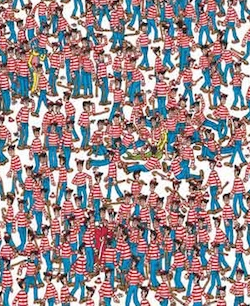
I wanted my digipak to be fun and interesting as often the indie genre is just this thus conforming to the conventions of an indie album cover. I decided to base my digipak on the hit selling books 'Wheres Wally'. The idea came about as the name 'Blonde Louis' focus's on the features. Every time I think of 'Blonde Louis' i think of a young boy in a blonde wig. Moreover the indie fashion involves stripes and the nautical trend, similar to that of Wheres Wally.  I think that is very significant that they named their band 'Blonde Louis' as it shows they think the image is key to the band. Therefore i had to incorporate the name with a intertextual element as the name is so unique but simple as it based on a person and their features. As Blonde Louis is an indie band their style is often quirky and retro referring back to the 90's as this was the influence when they were younger. Wheres Wally is also a quirky book from the 90's which was predominant in many childhoods. I though that incorporating this intertextual link between to different forms of media, into my digipak would create a fun, interesting and quirky style drawing two different audiences together. 

Instead of them dressed up as wally I though to use a blonde wig and guitar instead on the glasses, therefore it still keeps an element of originality. The Blonde wig referees to the name on the band and the guitar will reflect the genre of the band.

I also found inspiration from one of the Beatles album as I like how simple it was I was thinking to incorporate this into my digipak maybe on the cd. The other inspiration came from the Beatles album 'A hard days night' as I though I can incorporate the pop art style into my album cover.


Friday, 15 March 2013

Examples of professional digipak's


Professional Digipak's 

When I started to research digipaks, I felt it would be best to use some of my own as inspiration, that way it made me get a better idea of what a digipak feels like. 

1. Led Zeppelin- Mothership

Album cover


I thought that this front cover was very striking due to the bold use of colours. You can tell that the genre is rock because of the lightening bolts at the top of the album. This is one of the conventions of rock music and this symbol is widely recognised.

CD and opened


I liked how the layout was simple on this digipak as many digipak a have unique layouts. Personally, I prefer this layout as it is more pratical. Moreover the CD ties in with the theme of black and red adding continuity.

Insert


The insert is similar to the front cover. This is so the audience is familiar with their style they are trying to achieve. Moreover the symbol of the plane is very iconic for 'Led Zepplin' which adds to those brand image. 


2. The Beatles- A Hard Days Night

Album cover


I think that this album cover is very unique and stands out due to the pop art feel. It has each member of the band on the front which adds to the bands image creating a brand identity. It had conventions of the 60's such as bold images so it follows the rock n roll genre.


Inside
    

I like how this is unique inside. It folds how containing different slots for the insert and CD. The image of the apple is very iconic for the Beatles so it becomes instantly recognisable. Also i am inspired by the used of a mid shot to show the band together which lets the audience became familiar with the band.


Sunday, 10 March 2013

What is a Digipak?

Digipak's

Part of our coursework is to create a digipak to go alongside our music video. I have done some 
research into digipaks and how much it contributes to the overall success of the song. Digipak is a 
patented style of CD or DVD packaging. A CD digipak is usually folds out to four sections, each featuring different images of the artist or their influences. Digipaks always contains the artist or bands CD, a bonus item, it could be a DVD of their latest tour, posters, bonus tracks ect. 

In all, digipaks are designed in a way which is meant to attract fans and target audiences. They must have a aesthetically pleasing cover to attract the age, gender and the type of person who will like and listen to the music . However digipaks are also created for the companies finical interests, unlike regular albums which are easily downloadable from illegal websites, digipaks incise people into buying extra content which gives the artist some worth. 

For example Kasabians- Velociraptor contains a DVD with behind the scenes footage and bonus live tracks. 

Monday, 4 March 2013

Feedback from final cut


Feedback from final music video.

My feedback from my final music video has improved vastly compared to the rough cut. The main areas i wanted to improve on were:

  • Lip syncing
  • narrative
  • The closing shot
After i got all of this feedback i took it on board and focused the re filming in these areas. My final music video synchronisation was a lot better and showed the continuty from the previous rough cut.  Another one of my peers said that the use of props such as drums and guitars added to the indie mise en scene. The narrative was a lot clear because i re filmed some shops to show the lead singer and the love interest arguing and together. After viewing my final cut, my school friends also commented on how the ending was more effective as it finished of both the narrative and the performance. Moreover, they have said that the band image that I have created is clear and corresponds with the genre of music and my target audience.


Friday, 1 March 2013

Final music video


Final Music Video: Blonde Louis- Sleep on the Floor


This is my final cut for the Blonde Louis- Sleep on the Floor music video. I feel that i have achieved more than i expected in terms of the editing and found it enjoyable to create. Hope you enjoy!